
Pleasure of painting - Introduction to painting
- Stencils
- Painting on wood
- Wood cutting
- Varnishing furniture
- Ceramic painting
- Fabric painting
- Painting on glass
- Porcelain painting
- Decorating wooden rods
- Trompe l'oeil painting
- Natural paint
- Painting basics
- Landscape painting

Micro-macramé jewelry

Creation of micro macramé jewelry combining stones and braided threads: bracelets, necklaces, key rings
Creation of micro macramé jewelry combining stones and braided threads: bracelets, necklaces, key rings
The basic rules of painting - landscape
Composition
Draw an imaginary vertical line in the right or left third. This is where you will position the main subject, the one that interests you. Think of it as the one that should be emphasized. The painting will be built around geometric shapes. They give the picture its structure.
Perspective
The horizon line, the position of your eyes when the painting is in front of you, is a visible horizontal line if it's a seascape, imaginary in other cases.
Everything above: As many horizontal lines that meet at their vanishing point, on the horizon.
Everything below: Ditto, the horizontal lines meet at the horizon.
Vertical lines: Simple, they're always vertical. (This is what cameras do so badly, due to the spherical structure of their lenses)
Main point: This is the point where the horizontal lines meet For example, the rails of a railroad converge and meet at a point on the horizon.
Values
In nature, if you look at a landscape offering your gaze a foreground, a middle ground, then more distant planes, such as mountains in the distance, the transparency of the air becomes veiled, opaque with distance. If you're in the water, and you look ahead, the phenomenon is amplified. A goldfish loses its color as it moves away, until it becomes black.
Foregrounds: They are entitled to the most transparent look,
Medium shots: Begin to fade,
Distant shots: are in the grayish blues, opacified by the foggy or dust-laden atmosphere.
Recommendation: this doesn't prevent you from taking into account, in a stormy mountain landscape, the ray of sunlight which, projected onto a village, will make it luminous. This, of course, will be the element in the picture to highlight.
The colors
|
The primaries: blue, yellow and red are the basic colors, from which you can create all the colors in your palette.
You'll also need: white and black, to make gray.
Remarks : Black and white give a slightly bluish gray, Black, yellow and white give a green gray. Green and a touch of red give a faded green. Complementary colors You obtain them by mixing the primary colors as follows: |
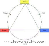 |
For oil paints :
Turpentine can be used: to obtain shadow colors, and incidentally to clean brushes Linseed oil is useful for impastos and to bring out the light.